【前端拾遗】前端布局方案
2020-05-09
9 min read
1. 实现盒子水平垂直居中的几种方案?
解答:
实现盒子水平垂直居中在flex提出之前,最常用的方法是通过position定位实现,主要有三种方式:
- 方式一: 通过相对父级容器进行定位,缺点:必须知道box的宽高
body{
    height:100%
    overflow:hidden;
    position:relative;
}
.box{
    width:100px;
    height:50px;
    position:absolution;
    margin-top:-25px;    /* 移动半个box */
    margin-left:-50px;
}
- 方式二:缺点:可以不知道box的宽高,但box必须定义宽高
body{
    height:100%
    overflow:hidden;
    position:relative;
}
.box{
    width:100px;
    height:50px;
    position:absolution;
    top:0;
    left:0;
    right:0;
    bottom:0;
    margin:auto 0;
}
- 方式三 无需考虑box的宽度与高度,缺点:低版本浏览器兼容性不太好
body{
    height:100%
    overflow:hidden;
    position:relative;
}
.box{
    position:absolution;
    top:50%;
    left:50%;
    transform:translate(-50%,-50%);   /* css3中移动位置  */
}
采用弹性盒子模型后可以使用如下方式:
body{
    height:100%;
    display:flex;
    justify-content : center;  //水平居中
    align-items : center;   //垂直居中
}
还能采用JS来实现盒子模型
<body>
    <div class="box">
    </div>
    <script>
        let HTML = document.documentElement,
            winW = HTML.clientWidth,
            winH = HTML.clientHeight,
            boxW = box.offsetWidth
            boxH = box.offsetHeight;
        box.style.postion = "absolution";
        box.style.left = winW-boxW)/2 + 'px';
        box..style.top = ()
    </script>
</body>
body{
    position:relative;
}
2. 盒子模型相关
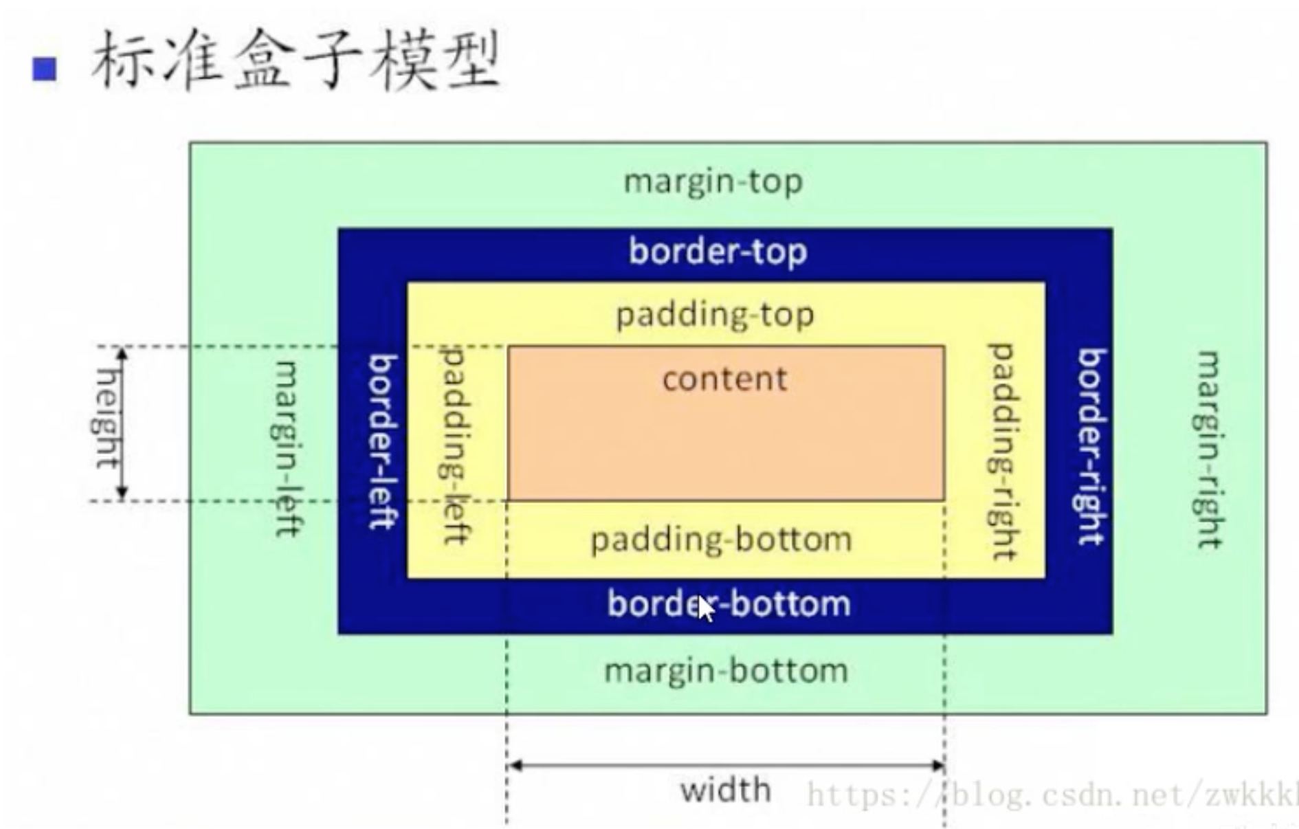
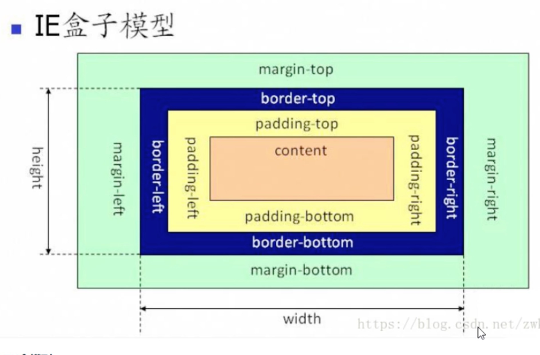
- 盒子模型分为 :
- 标准盒子模型 box-sizing:content-box
- 怪异盒子模型(也就是IE盒子模型) box-sizing:border-box
- 弹性伸缩布局盒子模型(flex)
标准盒子模型width与height指定的是content的宽高。标准盒子模型有一个明显的缺陷,当我们修改border或padding后盒子整体实际宽高会发生变化,这就会整体页面布局出错。而怪异盒子模型的width与height是盒子整体的宽高,修改其padding与border盒子会自动伸缩content。目前主流的bootstrap等ui组建大部分默认采用了怪异盒子模型。
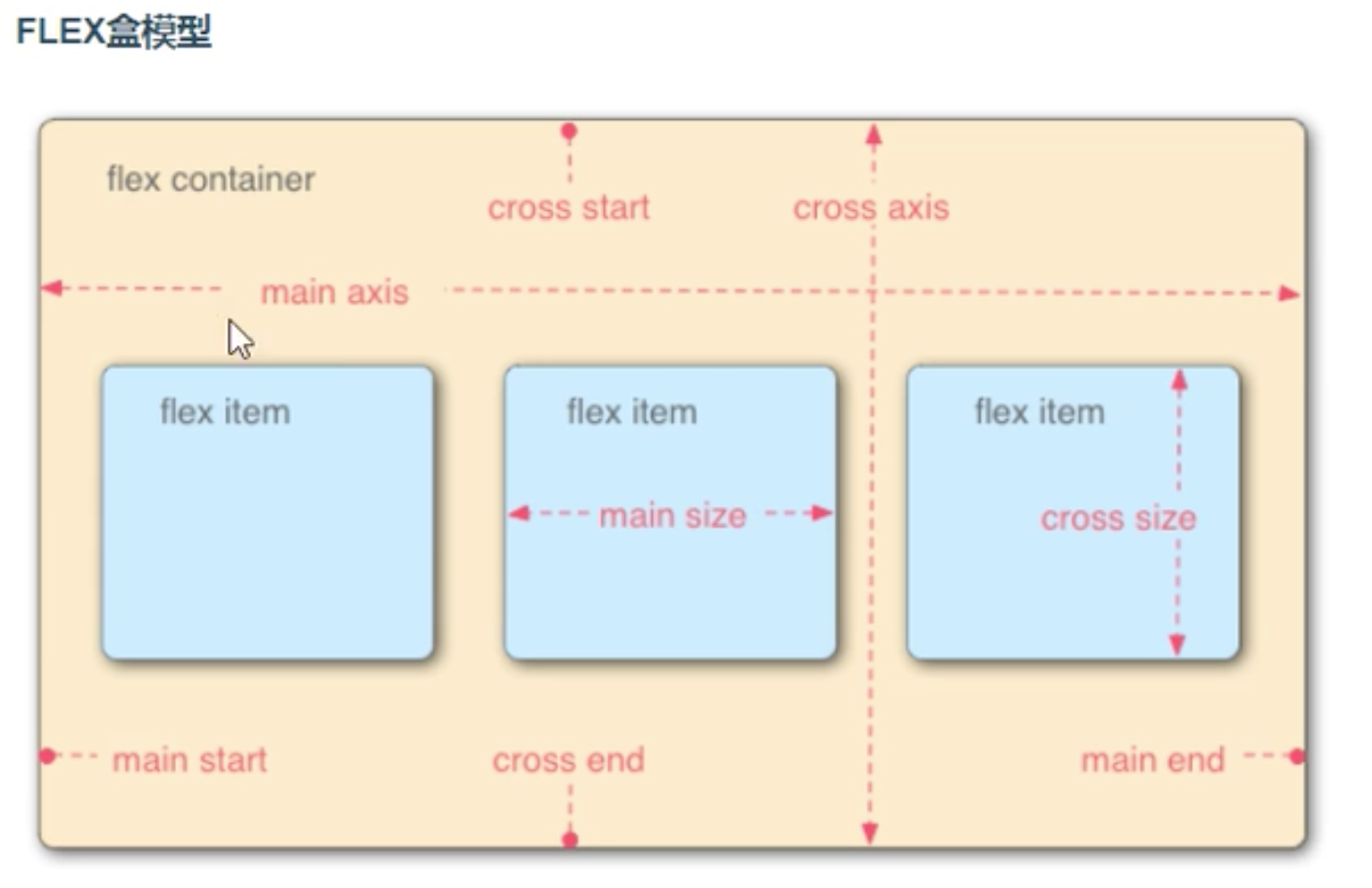
FLEX盒模型 :为布局实现提供了灵活性
3.经典布局方案
圣杯布局 : 左右固定,中间自适应 (双飞翼布局与之类似,不做详细讨论了).圣杯布局和双飞翼布局是前端工程师需要日常掌握的重要布局方式。两者的功能相同,都是为了实现一个两侧宽度固定,中间宽度自适应的三栏布局。
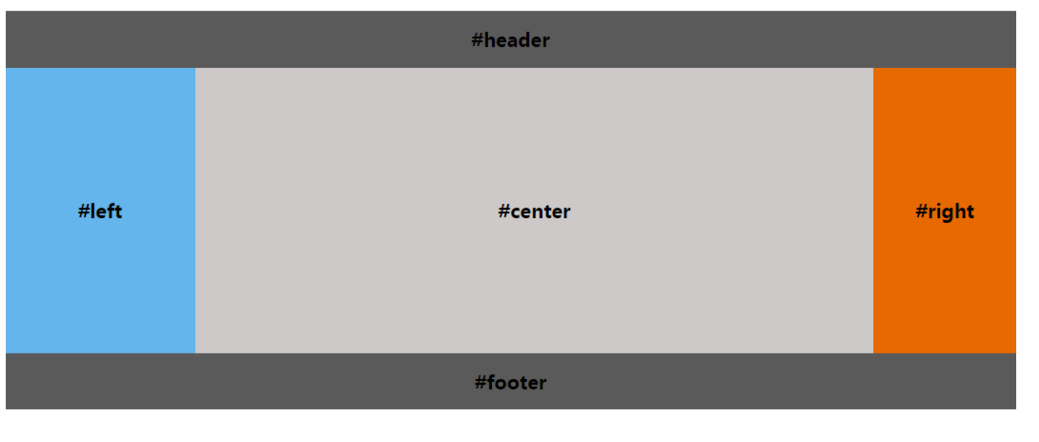
实现圣杯布局的要求
- header和footer各自占领屏幕所有宽度,高度固定。
- 中间的container是一个三栏布局。
- 三栏布局两侧宽度固定不变,中间部分自动填充整个区域。
- 中间部分的高度是三栏中最高的区域的高度。
圣杯布局的三种实现方式
- 浮动
- 先定义好header和footer的样式,使之横向撑满。
- 在container中的三列设为浮动和相对定位(后面会用到),center要放在最前面,footer清除浮动。
- 三列的左右两列分别定宽200px和150px,中间部分center设置100%撑满
- 这样因为浮动的关系,center会占据整个container,左右两块区域被挤下去了
- 接下来设置left的 margin-left: -100%;,让left回到上一行最左侧
- 但这会把center给遮住了,所以这时给外层的container设置 padding-left: 200px;
- padding-right: 150px;,给left和right空出位置
- 这时left并没有在最左侧,因为之前已经设置过相对定位,所以通过 left: -200px; 把left拉回最左侧
- 同样的,对于right区域,设置 margin-right: -150px; 把right拉回第一行
- 这时右侧空出了150px的空间,所以最后设置 right: -150px;把right区域拉到最右侧就行了
<html>

<style>
  body {
    min-width: 550px;  /* 2x leftContent width + rightContent width */
    font-weight: bold;
    font-size: 20px;
  }

  #header, #footer {
    background: rgba(29, 27, 27, 0.726);
    text-align: center;
    height: 60px;
    line-height: 60px;
  }
  #footer {
    clear: both;
  }

  #container {
    padding-left: 200px;   /* leftContent width */
    padding-right: 150px;  /* rightContent width */
    overflow: hidden;
  }

  #container .column {
    position: relative;
    float: left;
    text-align: center;
    height: 300px;
    line-height: 300px;
  }

  #center {
    width: 100%;
    background: rgb(206, 201, 201);
  }

  #left {
    width: 200px;           /* leftContent width */
    right: 200px;           /* leftContent width */
    margin-left: -100%;
    background: rgba(95, 179, 235, 0.972);
  }

  #right {
    width: 150px;           /* rightContent width */
    margin-right: -150px;   /* rightContent width */
    background: rgb(231, 105, 2);
  }

</style>

<body>
  <div id="header">#header</div>
  <div id="container">
    <div id="center" class="column">#center</div>
    <div id="left" class="column">#left</div>
    <div id="right" class="column">#right</div>
  </div>
  <div id="footer">#footer</div>


</body>

</html>
- Flex弹性盒子
- header和footer设置样式,横向撑满。
- container中的left、center、right依次排布即可
- 给container设置弹性布局 display: flex;
- left和right区域定宽,center设置 flex: 1; 即可
<!DOCTYPE html>
<html>
<style>
  body {
    min-width: 550px;
    font-weight: bold;
    font-size: 20px;
  }
  #header, #footer {
    background: rgba(29, 27, 27, 0.726);
    text-align: center;
    height: 60px;
    line-height: 60px;
  }
  #container {
   display: flex;
  }
  #container .column {
    text-align: center;
    height: 300px;
    line-height: 300px;
  }
  #center {
    flex: 1;  /*  自动占用剩余所有空间 */
    background: rgb(206, 201, 201);
  }
  #left {
    width: 200px;
    background: rgba(95, 179, 235, 0.972);
  }
  #right {
    width: 150px;
    background: rgb(231, 105, 2);
  }
</style>

<body>
  <div id="header">#header</div>
  <div id="container">
    <div id="left" class="column">#left</div>
    <div id="center" class="column">#center</div>
    <div id="right" class="column">#right</div>
  </div>
  <div id="footer">#footer</div>
</body>

</html>
3.Grid布局
如上图所示,我们把body划分成三行四列的网格,其中有5条列网格线
- 给body元素添加display: grid;属性变成一个grid(网格)
- 给header元素设置grid-row: 1; 和 grid-column: 1/5; 意思是占据第一行网格的从第一条列网格线开始到第五条列网格线结束
- 给footer元素设置grid-row: 1; 和 grid-column: 1/5; 意思是占据第三行网格的从第一条列网格线开始到第五条列网格线结束
- 给left元素设置grid-row: 2; 和 grid-column: 1/2; 意思是占据第二行网格的从第一条列网格线开始到第二条列网格线结束
- 给center元素设置grid-row: 2; 和 grid-column: 2/4; 意思是占据第二行网格的从第二条列网格线开始到第四条列网格线结束
- 给right元素设置grid-row: 2; 和 grid-column: 4/5; 意思是占据第二行网格的从第四条列网格线开始到第五条列网格线结束
<!DOCTYPE html>
<html>

<head>
  <meta charset="utf-8">
  <script src="http://lib.sinaapp.com/js/jquery/2.0.2/jquery-2.0.2.min.js"></script>
</head>
<style>
  body {
    min-width: 550px;
    font-weight: bold;
    font-size: 20px;
    display: grid;
  }
  #header,
  #footer {
    background: rgba(29, 27, 27, 0.726);
    text-align: center;
    height: 60px;
    line-height: 60px;
  }
  #header {
    grid-row: 1;
    grid-column: 1/5;
  }
  #footer {
    grid-row: 3;
    grid-column: 1/5;
  }
  .column {
    text-align: center;
    height: 300px;
    line-height: 300px;
  }
  #left {
    grid-row: 2;
    grid-column: 1/2;
    background: rgba(95, 179, 235, 0.972);
  }
  #center {
    grid-row: 2;
    grid-column: 2/4;
    background: rgb(206, 201, 201);
  }
  #right {
    grid-row: 2;
    grid-column: 4/5;
    background: rgb(231, 105, 2);
  }
</style>

<body>
  <div id="header">#header</div>
  <div id="left" class="column">#left</div>
  <div id="center" class="column">#center</div>
  <div id="right" class="column">#right</div>
  <div id="footer">#footer</div>
</body>

</html>
4.移动端的自适应解决方案
- .media
- rem
- flex
- vh/vw
- .......